Thank you for visiting the Focus on Function Web Design website and printing this page.
I hope you'll visit online again soon at www.fofwebdesign.co.uk
Case Study: HMS Garden Design
HMS Garden Design supplies quality garden services to clients throughout the local Chesterfield and Derbyshire area. The company specialises in offering a friendly, professional design service, no matter what the size of the garden.
With a fully qualified designer from the KLC Garden Design School, who has additional qualifications in RHS Level 2 in Horticulture, HMS Garden Design continues to build on a team that was initially founded in 2006, while supporting local industry by employing local tradesmen to undertake all construction, and by sourcing all plants from a local, family-run nursery.
Key Features and Requirements
- A sleek, fuss-free website design that delivers clear direction and call-to-action (CTA)
- Logo redesign and other market brand imagery for website, leaflets and stationary
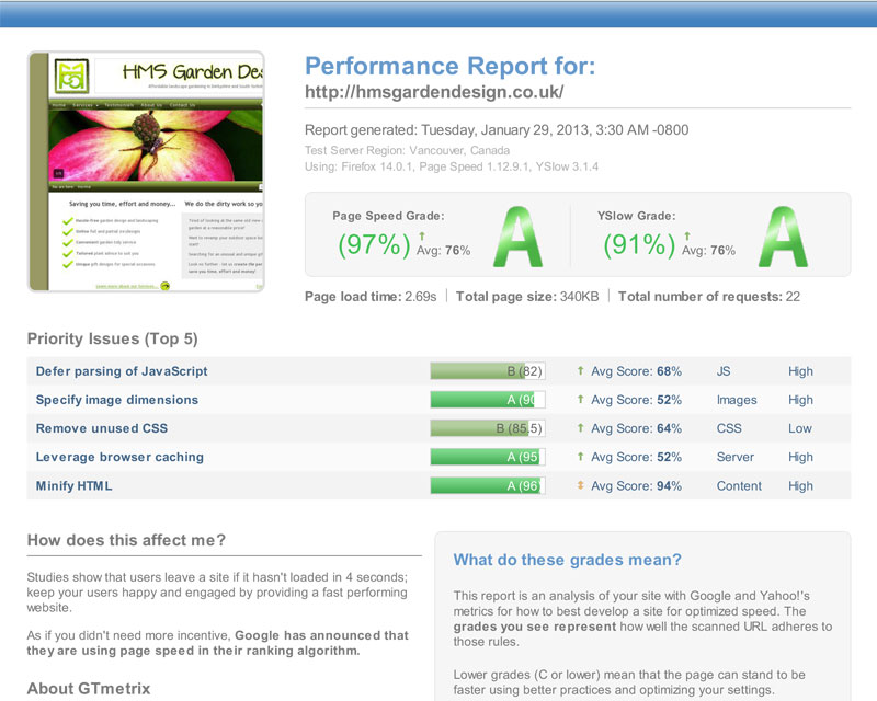
- Speed optimisation and Search Engine Optimisation (SEO) for improved online visibility
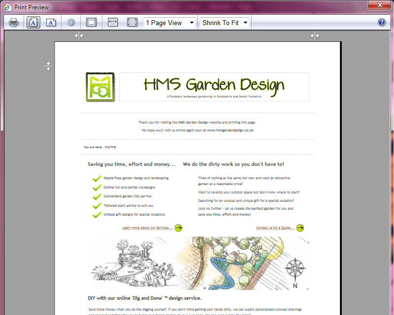
- Custom styled print-page layouts to facilitate ink-friendly visitor printing
- A customised administration panel that is easy to use and meets needs by providing;
- An interchangeable one or two column layout, depending on content
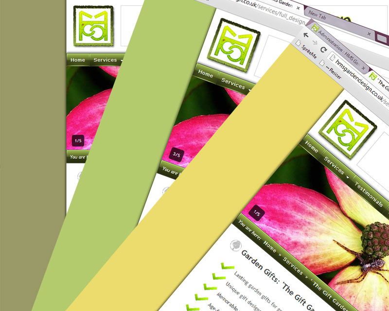
- Selectable colour-coded styling for different menu categories
Website Design
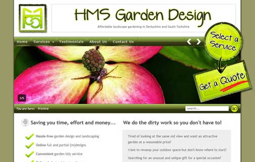
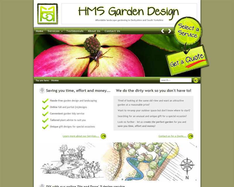
Initially, Helen at HMS Garden Design came to me with a design brief for a fuss-free, sleek website, that would appeal to young professionals looking to redesign their outdoor living space.
We discussed her initial design ideas that she had diligently sketched out on paper, and while the layout she presented was already well planned and clutter-free, we came to a compromise with regard to making better use of available space, while at the same time choosing a colour palette based on her trade colours.
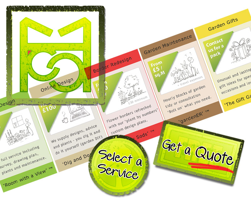
Two large call-to-action graphics were added to the header to direct visitors down the ideal path; to "Select a Service" and then ultimately "Get a Quote".
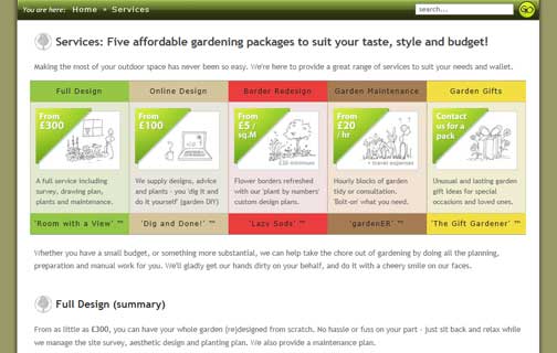
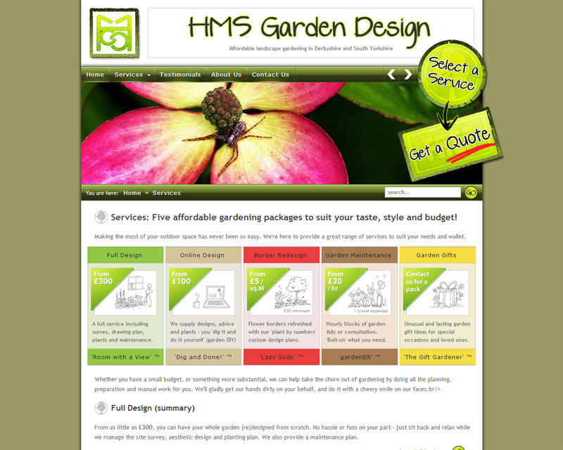
Additionally, the services page received further focus with 5 prominent "cards" acting as visual summaries of the services offered.
Market Brand Imagery
As well as developing an online presence, plans were also put in place to promote HMS Garden Design via more traditoninal avenues - namely, with leaflets and mailshots. Additionally, several customer focused documents (survey templates and client guidance sheets) were made available via the website in the form of PDF downloads.
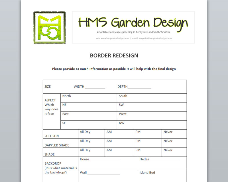
Letter and other paper templates, featuring the company logo and banner in the masthead, were produced to support Helen's data collection and other administrative tasks.
Artwork for HMS Garden Design services was also prepared a few months later to further support printed publications and upcoming local promotions.
Search Engine Optimisation (SEO)
The HMS Garden Design website has been hand coded, with careful consideration being given to content separation and a logical markup structure to give it the best possible footing on the web.
In-page optimisation efforts include custom metadata, strong keyword emphasis and distribution, and the reorganisation of supplied copy, to place the most important points higher up the page.
Speed optimisation has also been addressed by the use of compressed image sprites (reducing HTTP Requests), custom server and .htaccess configuration (setting ETags and expires headers), gzipped content, CSS and JavaScript files, and by generally keeping code and markup to a minimum.
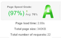
The site's performance has been tested with Google and Yahoo developer tools (scoring 2 much-higher-than-average A grades) and is presented below as evidence;
Print-Page Layouts
Owing to the nature of the HMS Garden Design website, where it is likely that visitors may like to print service information to read at their leisure, special efforts were made to ensure that any prints made directly through the web browser would result in clean, minimal pages that don't use a huge amount of coloured ink.
Print-only stylesheets have been used to remove ink-hungry banner images, and obsolete menus and buttons (that are pointless on paper) from the final print-page layouts, while a replacement web address has been added to allow visitors to make a return visit by typing the domain name directly into a web browser.
Customised Administration Panel
The administration panel supplied as part of the HMS Garden Design website package is a customised version of my bespoke Content Management System (CMS), Fast Edit.
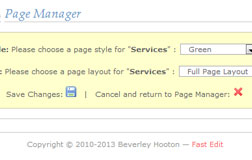
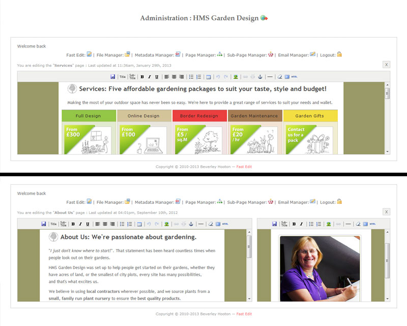
During the consultation and design process, we identified a need for a split-page layout on some pages, and a full-page layout on others. Helen also requested colour-coded styling based on different menu categories.
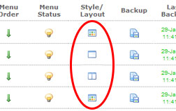
My in-house CMS did not support differing page layouts or pre-defined style selections at that time, so that prompted me to re-write parts of the interface to allow a switch between these two options. Helen can now edit all of her web pages with ease, as the editing window automatically divides into two panels when it recognises a split-page layout.
Similarly, creating new pages is just as easy thanks to a switch in the back-end that allows Helen to change layouts, and select from predefined page styling, depending on her needs.
Website Designs
Read the case studies
For a more in-depth look as some of the website projects I've worked on, please take a look at these case studies;
- DHFS (Digital Signage) case study
- DHFS (Mobile News Portal) case study
- HMS Garden Design case study
- JemCon.org case study
Read testimonials, reviews and feedback
You can find out what happy customers are saying about my work by reading their testimonials.
Contact me for prices, discuss a project, or ask a question
Are you ready to take the next step? Please contact me to chat about your website design project.
